
Design Challenge

Challenge 1 - Mobile App Design
Louise is a waitress who needs:
A way to see her work schedule
A quick way to clock-in and out
A way to log her work hours


The Process
-
Direct & Full Access to 4 competitor apps:
Hotschedules
Justworks
UKG Dimensions
Paycom
Internet research of 3 other apps:
Sling
Restaurant365
7 Shifts
-
Created 3 flows based on user needs & scope of this specific challenge.
Used the user flows to help inform wireframe design
-
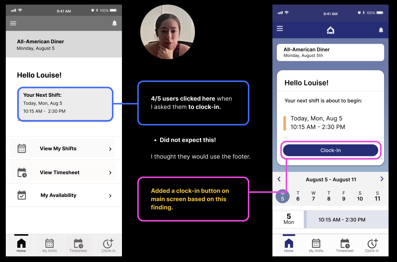
Tested Prototype with 5 Servers
After usability tests, the prototype was Iterated based on key findings from the tests.
-
Created Hi-Fidelity prototype after making the iterations with the findings from the usability tests.
Step 1 - Competitor Analysis
Looked into the flow and function of 7 apps:
Hotschedules
Justworks
UKG Dimensions
Paycom
Sling
Restaurant365
7 Shifts
This was a great start, as it helped me:
Understand what sort of models users are most familiar with and how users must navigate through flows similar to what I was tasked with
I was able to get full and direct access to 4 of these apps.
Although not formal user interviews, when possible, I asked actual users about their experience.
Step 2 - Created V1 Prototype
Created a basic user flow after researching and using competitor apps.
Prototyped 3 flows:
View your work schedule
Clock in and out of a shift
See your logged hours

Step 3 - Usability Testing the Prototype
5 Usability tests with servers - Here’s what I learned:


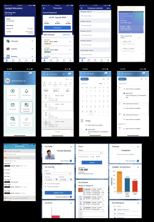
Hi-Fi Prototype

Challenge 2 - Desktop Design
Jim is supervisor who needs:
the ability to view the work schedule for all 10 of his employees next week
My Process
Deep dive into existing examples of scheduling web apps
Create a basic structure with auto-layout on Figma
Stay consistent with mobile app branding [colors and general style] for cohesion between mobile & desktop.


Well… That is to be determined!
I was able to showcase it to 5 people to see if they understood how it worked. All 5 people were able to understand it overall.
…but Ideally I would have liked to do more formal tests.
If I had more time, this is what I would do:
Create multiple user flows for the desktop app
Prototype the screens
Test the prototype on supervisors who schedule employees
Created cohesion between mobile & desktop, by:
Using the same color palette
Same background style [gradient blue] with white overlays
Same iconography style
Same use of font style [Inter - Regular, Medium, Semi-bold]
Same overall feel + tone
But… Is it usable?

Branding Cohesion
Summary and Retrospective
Overall, I’m quite happy with the mobile design. Very happy that I was able to test it, even if just with one round of tests. Moving forward I would want to test the iterated prototype.
I spent 2 full days trying to coordinate with servers so that I could conduct usability test with them (all the while, I was researching competitors), and didn’t really start designing until day 3. I asked some random servers in-person & online if I could see (and even use) their apps, and I was blown away with the generosity and willingness to be of help!
The desktop design could be polished quite a bit, but I think it is a solid foundation to move forward. Would love to expand, test it with actual supervisors to see how usable it really is. Definitely far from finished, but just the beginning.
Almost all desktop web apps that I analyzed used a similar style to view employee schedules. I modeled my design after these trends to create something familiar that aligns with widely used mental models.
Overall — a solid start, but still a lot more that I would like to do!
